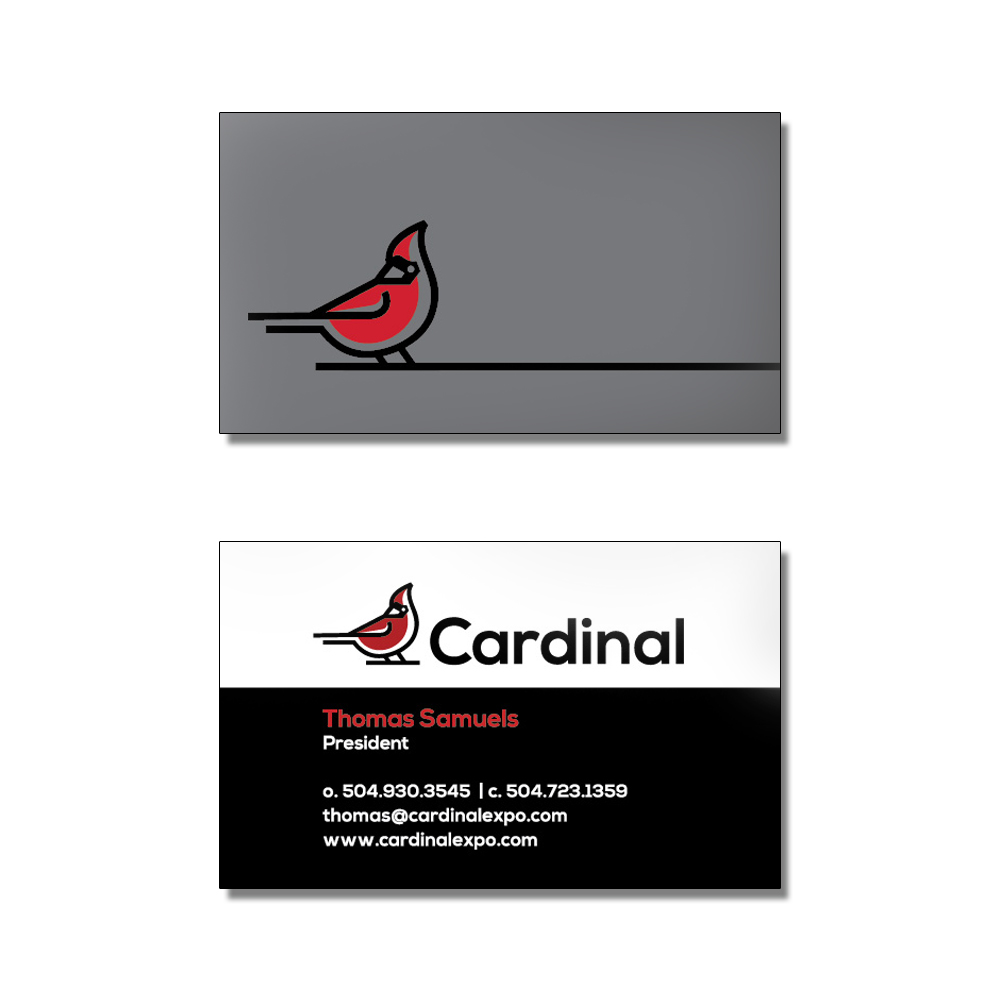
With 2020 behind them, exhibit design and rental company Cardinal Expo sought to enter the new year with a re-design of their brand. Having moved away from their former title of “CX Exhibits,” a cardinal became the new, visual representation for their brand. One important decision was made: to have the cardinal’s red be what draws one in. All the while, its vibrant and fun color is paired with neutrals of white and black, and often backed with a steel grey. This allows the balance Cardinal Expo seeks of artistic creativity while still maintaining an “industrial” feel of the competent and dependable structures built for client exhibits. These elements have since been applied to business cards as well as their website http://www.cardinalexpo.com
Project: Cardinal Expo Brand Design
Colors: Cardinal Red (ce202f), Steel Grey (76777a), White, Black
Fonts: Nexa Bold, Rubik
Role: Graphic Designer & Web Designer
Programs: WordPress, Illustrator, Photoshop